
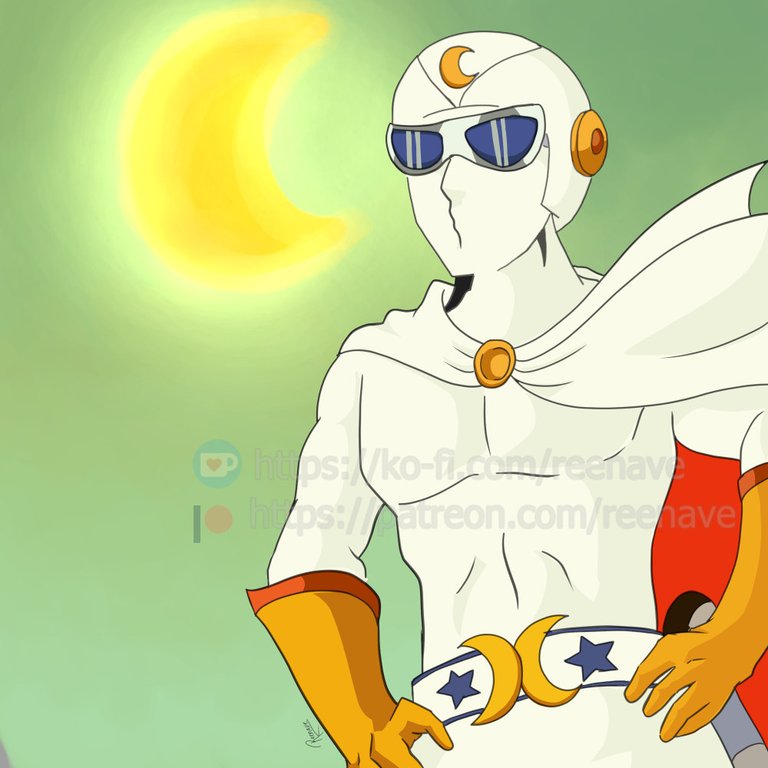
Fanart of the anime Gekko Kamen
¡Qué tal, tribu creativa!
¿Listos para darle vida y emoción a sus ilustraciones con el poder del color? Hoy quiero platicarles de cómo usar la teoría del color para armar paletas y esquemas de color que realmente funcionen y potencien su storytelling.
Oye, Reena, ¿por dónde empiezo si lo mío es más de “me gusta todo, pongo rojo, azul y verde”?
Pongámoslo así: la teoría del color es como el manual de instrucciones para que tus combinaciones no choquen ni se vean desordenadas. Primero, ubica la rueda de color: en ella verás los colores primarios (rojo, amarillo y azul), los secundarios (naranja, verde y violeta) y los terciarios (esas mezclas intermedias). Con esa rueda clara, podrás elegir armonías sin andar a ciegas.
1. Armando tu paleta básica con armonías
• Complementarios: son pares opuestos (rojo y verde, azul y naranja, amarillo y violeta). Generan contraste alto y energía. Genial para escenas dinámicas o personajes con mucha actitud.
• Análogos: colores que están lado a lado en la rueda (azul–verde–turquesa). Ofrecen una sensación más relajada y coherente. Perfectos para paisajes, atmósferas serenas o efectos “dreamy”.
• Tríadas: tres colores equidistantes en la rueda (rojo, amarillo y azul, o verde, naranja y violeta). Crean paletas balanceadas y vivas, sin forzar tanto contraste.
• Divididos complementarios: un color principal y los dos adyacentes a su complementario (por ejemplo, púrpura con amarillo-verde y amarillo-naranja). Es un truco para suavizar el contraste sin renunciar al dinamismo.
Entiendo la teoría… pero ¿cómo paso del papel al pixel?
Primero, define la emoción o atmósfera que quieres transmitir. ¿Es una escena de batalla épica? Ve por complementarios y acentúa sombras saturadas. ¿Un momento nostálgico? Prueba análogos con grises cálidos o fríos. ¿Algo divertido y juvenil? Las tríadas te dan esa vibra juguetona.
2. Tips para pulir tu esquema de color
• Empieza con un “color base” que ocupe alrededor del 60 % de tu lienzo. Suele ser el tono neutro o el dominante de fondo.
• El “color secundario” (30 %) es el que usarás en personajes principales, elementos clave o centros de interés.
• El “color de acento” (10 %) es tu arma secreta para destacar botones, luces, detalles del vestuario o props. Un punto de color vibrante puede guiar la mirada del lector.
¿Y si siento que todo se ve muy plano?
Añade variaciones de valor y saturación. Puedes bajar la saturación en los fondos para empujar al primer plano, y subirla en el midground y foreground donde estén tus personajes. También, jugar con valores (más claro o más oscuro) te ayuda a crear profundidad incluso en un dibujo en dos dimensiones.
3. Herramientas que facilitan la vida
• Coolors.co: genera paletas automáticas basadas en reglas de armonía. Puedes bloquear un color y dejar que el sitio complete el resto.
• Adobe Color: explora tendencias y temas. Copia paletas de artistas y ajusta al gusto.
• Paletti (para móviles): simplísimo para elegir tonos a partir de una foto o un boceto rápido.
¡Genial! Pero a veces la teoría suena rígida…
Claro, no se trata de convertirse en un robot cromático. Usa la teoría como guía, no como jaula. Si un color que “no cuadra” te gusta, ¡ponlo! A veces romper la regla, con moderación, genera resultados únicos. Eso sí, revisa que tu acento cromático no canibalice toda la composición.
4. Ejercicio rápido para entrenar tu ojo
- Elige una imagen o captura de referencia que te inspire.
- Identifica tres colores dominantes y anótalos.
- Ubícalos en la rueda de color y averigua si forman una armonía clásica (análoga, complementaria, etc.).
- Recrea la paleta en tu software favorito y pinta un boceto sencillo.
- Juega modificando la saturación y el valor. Observa cómo cambia el mood.
¿Y después de todo esto, cómo aprovecho mis nuevas paletas?
Guárdalas en tu banco de recursos: carpetas, bibliotecas de pinceles o paletas dentro del programa. Así, cada vez que empieces un nuevo cómic, manga o ilustración, vas a tener un kit listo que refleje tu estilo y evite ese “pánico de la página en blanco cromática”.
Para cerrar, acuérdate: el color es un narrador más. No solo adorna, también dirige sentimientos y marca ritmo visual. Con un poco de práctica y estas reglas en tu arsenal, tus dibujos ganarán impacto, armonía y personalidad.
Mil gracias por acompañarme en otra charla creativa. Si te gustó este post, te invito a unirte a mi canal de YouTube y a seguirme en TikTok, donde comparto más tips de dibujo, speed paints y behind the scenes de mis paletas favoritas. ¡Nos vemos en la próxima, y que el color siempre encuentre tu pincel!
Tu compañera de matices,
Reena
Mis blogs: Noise Steemit Hive Publish0x Medium
Mis redes sociales: Instagram Facebook Twitter YouTube TikTok
Mis tiendas: Redbubble
Comisiones Abiertas: Fiverr
Suscríbete, dale like y comparte si estás disfrutando la historia para que recibas notificación al haber actualización!

Fanart of the anime Gekko Kamen
Hey, creative tribe!
Ready to bring life and emotion to your illustrations with the power of color? Today, I want to talk to you about how to use color theory to create palettes and color schemes that really work and enhance your storytelling.
Hey, Reena, where do I start if I'm more of a "I like everything, I'll put red, blue, and green" kind of person?
Let's put it this way: color theory is like the instruction manual to ensure your combinations don't clash or look disorganized. First, locate the color wheel: on it, you'll see the primary colors (red, yellow, and blue), the secondary colors (orange, green, and purple), and the tertiary colors (those intermediate mixes). With that wheel clear, you'll be able to choose harmonies without going in blind.
1. Building your basic palette with harmonies
- Complementary: these are opposite pairs (red and green, blue and orange, yellow and purple). They generate high contrast and energy. Great for dynamic scenes or characters with a lot of attitude.
- Analogous: colors that are next to each other on the wheel (blue-green-turquoise). They offer a more relaxed and coherent feeling. Perfect for landscapes, serene atmospheres, or "dreamy" effects.
- Triadic: three colors equidistant on the wheel (red, yellow, and blue, or green, orange, and purple). They create balanced and lively palettes, without forcing too much contrast.
- Split Complementary: one main color and the two adjacent to its complement (for example, purple with yellow-green and yellow-orange). It's a trick to soften the contrast without giving up dynamism.
I understand the theory… but how do I go from paper to pixel?
First, define the emotion or atmosphere you want to convey. Is it an epic battle scene? Go for complementary colors and accentuate saturated shadows. A nostalgic moment? Try analogous colors with warm or cool grays. Something fun and youthful? Triadic colors give that playful vibe.
2. Tips to refine your color scheme
- Start with a "base color" that occupies around 60% of your canvas. It's usually the neutral tone or the dominant background color.
- The "secondary color" (30%) is what you'll use for main characters, key elements, or points of interest.
- The "accent color" (10%) is your secret weapon to highlight buttons, lights, clothing details, or props. A vibrant point of color can guide the reader's gaze.
What if I feel like everything looks too flat?
Add variations in value and saturation. You can lower the saturation in the backgrounds to push the foreground, and increase it in the midground and foreground where your characters are. Also, playing with values (lighter or darker) helps you create depth even in a two-dimensional drawing.
3. Tools that make life easier
- Coolors.co: generates automatic palettes based on harmony rules. You can lock in a color and let the site complete the rest.
- Adobe Color: explore trends and themes. Copy palettes from artists and adjust to taste.
- Paletti (for mobile): super simple for choosing tones based on a photo or a quick sketch.
Great! But sometimes the theory sounds rigid…
Of course, it's not about becoming a chromatic robot. Use theory as a guide, not a cage. If a color that "doesn't fit" appeals to you, go for it! Sometimes breaking the rule, in moderation, generates unique results. Just make sure your chromatic accent doesn't cannibalize the entire composition.
4. Quick exercise to train your eye
- Choose an inspiring image or reference capture.
- Identify three dominant colors and note them down.
- Locate them on the color wheel and find out if they form a classic harmony (analogous, complementary, etc.).
- Recreate the palette in your favorite software and paint a simple sketch.
- Play with modifying the saturation and value. Observe how the mood changes.
And after all this, how do I take advantage of my new palettes?
Save them in your resource bank: folders, brush libraries, or palettes within the program. That way, every time you start a new comic, manga, or illustration, you'll have a ready kit that reflects your style and avoids that "chromatic blank page panic."
To wrap up, remember: color is another narrator. It doesn't just decorate; it also directs feelings and sets the visual rhythm. With a little practice and these rules in your arsenal, your drawings will gain impact, harmony, and personality.
Thank you so much for joining me in another creative chat. If you liked this post, I invite you to join my YouTube channel and follow me on TikTok, where I share more drawing tips, speed paints, and behind-the-scenes looks at my favorite palettes. See you next time, and may color always find your brush!
Your companion in hues,
Reena
Disclaimer:English is not my native language. Even when I have a conversational level, I can make a lot of mistakes in the structure of the sentences. Feel free to kindly correct me. It will help me in my learning process. Thanks for your understanding.***
My blogs: Noise Steemit Hive Publish0x Medium
My Social Networks Instagram Facebook Twitter YouTube TikTok
My shops: Redbubble
Commissions Open: Fiverr
Your tutorial was very easy to understand. You explained it step by step in a great way. Thanks for sharing 👍
Thank you very much! Glad to know it was useful. Color theory is one of the most difficult things to learn in illustration. I think the other struggles for artists are anatomy and perspective 🙂
Welcome 😊
Hello @reenave! The Anime Realm team here 😊.
We want to thank you for choosing this community to publish your manga and anime related content.
Don't forget to check the rules and the suggested community guidelines post. Also, always keep in mind the importance of visiting and supporting other users' posts, those will allow us to keep growing as users and as a community.
We hope to see you soon. Greetings!
Thanks for the support! ✨✨✨